Non-profit Adoption and Animal Welfare MOOC
Animal Welfare Advocacy and Education
-
• create a learning platform for potential adopters.
• provide resources and certification for pet ownership.text goes here
-
• Team turnover
• Content sourcing
Project Overview
The company
Dweebs Global PAWS group is a pet welfare initiative aiming to help potential adopters through the adoption process.
Timeline
6 months
The Team
2 User Experience Designers
1 User Experience Researcher
My Responsibilities
User Research, UI design, Wireframing, and Prototyping,
The target users
Prospective pet adopters, who are about to or have already gone through the pet adoption process.
Problem Statement:
In the US, 6.5 million animals enter shelters each year and only 3.2 million get adopted. Meanwhile, many adopters say they have difficulty getting approved for adoption.
How do we give potential adopters the tools needed to successfully adopt?
Defining the project…
The Basics (stakeholder meetings)
The main purpose of the website as well as the requirements
Color schemes: Pastels, neutrals, and browns to signify wellness
Audience
But what were the users’ experiences?
The requirements focused on creating a website for the PAWS group's objectives, but the UX team had some inquiries about the user demographic.
What did the users actually believe, think, and feel about the adoption process?
Where did they find the most relief from this?
At this point, our team made the case to leadership to conduct interviews with potential pet adopters. My role facilitated the following tasks to define what the team should do next:
Defined the research plan as a group
Designed screeners and research scripts
Set recruitment goals
User Research, Key Takeaways
We interviewed 8 people and determined their biggest pain points in the adoption process.
Adopters get discouraged during the vetting process due to rejections and long repetitive applications
Many first-time adopters don’t know what to expect from the process and wish for a resource for advice/help
Competitive Analysis
For the course module portion, we wanted to determine the industry standard for course design, so we reviewed 5 direct and indirect competitors.
Udemy, Animal Rescue Professionals, and Holly&Hugo were analyzed for certification course structure
For All Animals and SPCA was analyzed for its content structure
Competitive Analysis Key Takeaways
The visual design was kept minimal, sharp, and clean.
Courses were mostly taught in a modular format, which included quizzes that immediately followed videos
Content is written in a voice that is meant to inform, rather than lecture potential pet owners.
Spotlighting user frustrations
Empathy Findings:
Users found it frustrating to repeat the same application over and over again for different pets.
Users wanted a way to talk to other people about the process.
Adoption users were looking for guidance about pet adoption and ownership.
Expectations on rescue processes in the US were based on processes from several years ago.
Users found it frustrating to repeat the same application over and over again for different pets.
User Persona:
This persona was useful in the design of the website because it contextualized website design.
Menu Tree:
At the start of the project, the leadership team asked to test a site map structure using Maze.io to determine the best structure for the website. We recruited about 20 participants and iterated on the sitemap structure. After several revisions, we determined the site map below caused the least friction when walking through the label hierarchy.
Methodology:
Created Tasks, such as “sign up for a course” or “reach out to a shelter”
Determined which users were outliers, such as users that used the same path, regardless of the task.
Examining Maze.io metrics and determined
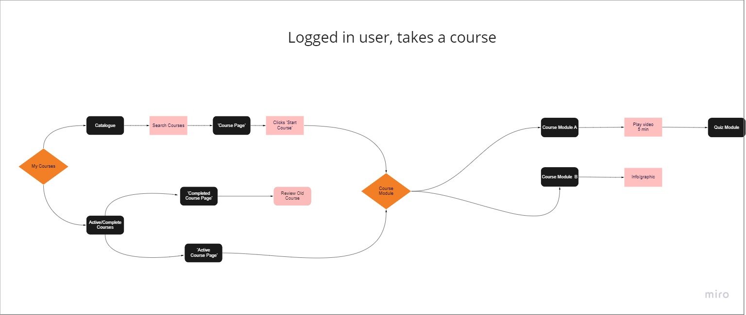
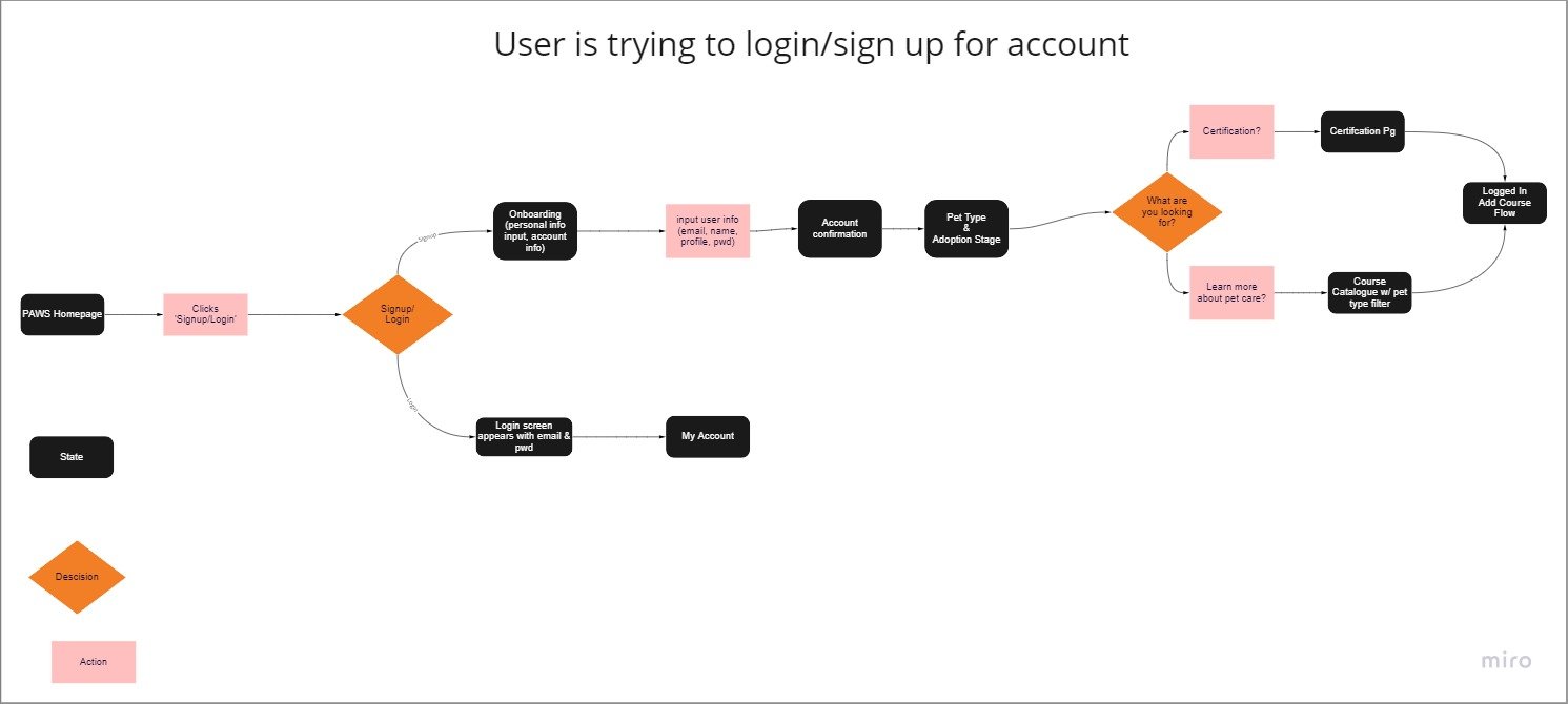
User Flows for Login, Certification, and Courses tasks.
One limitation of the sitemap was that it didn’t demonstrate the specific situations and tasks that users would find themselves in. So we turned to user flows to give a new dimension to the user’s experiences.. This would also help us identify any areas of improvement or clarify where there might be bottlenecks.
Information Architecture and User Flows
Design Process
Style Guide:
Through meeting with the stakeholders and researching color style trends, we created this style guide.
Low-fidelity Wireframe
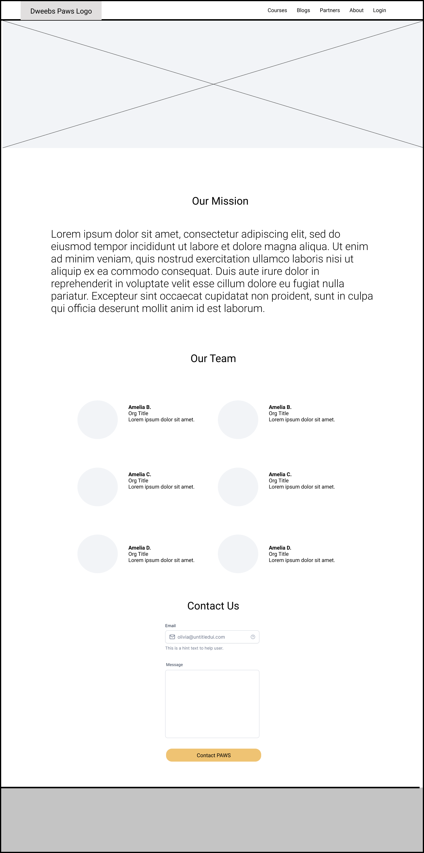
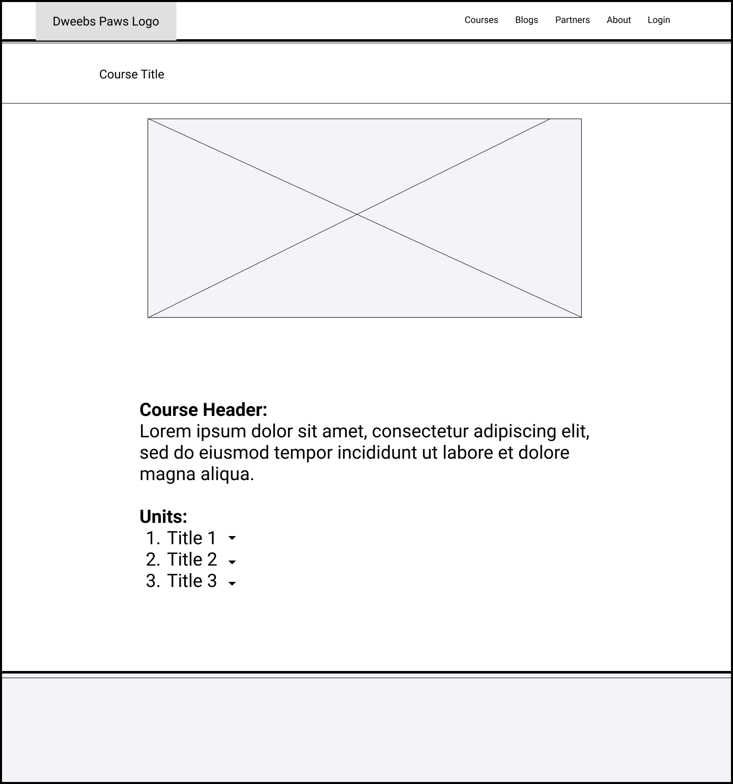
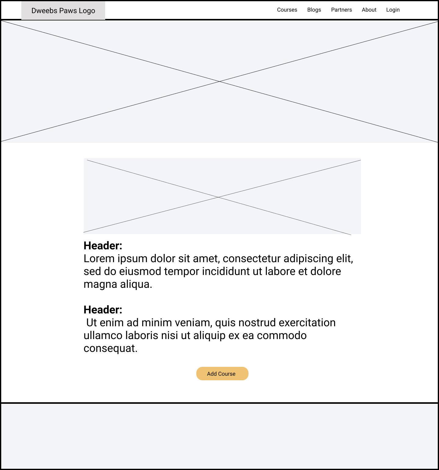
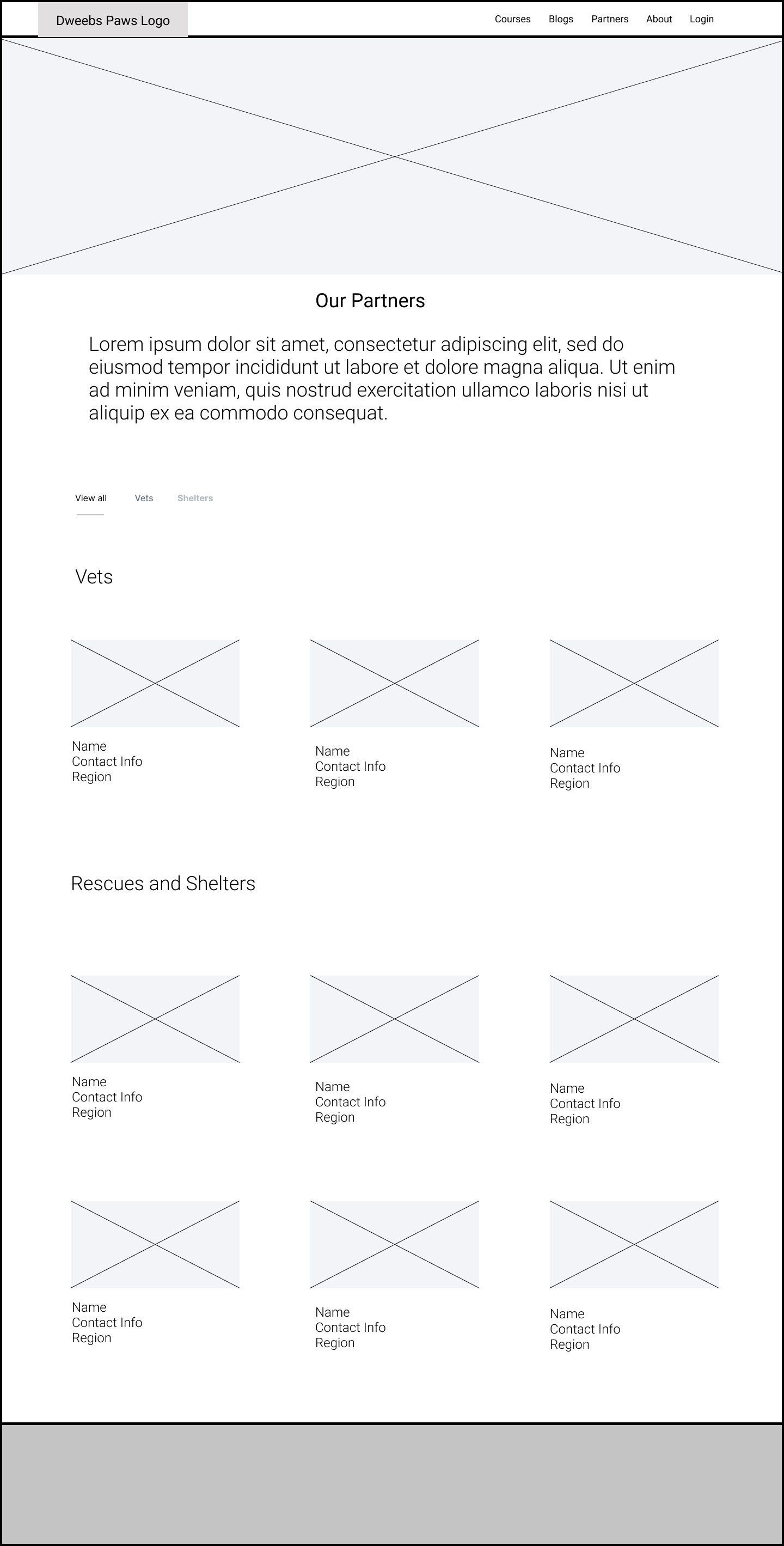
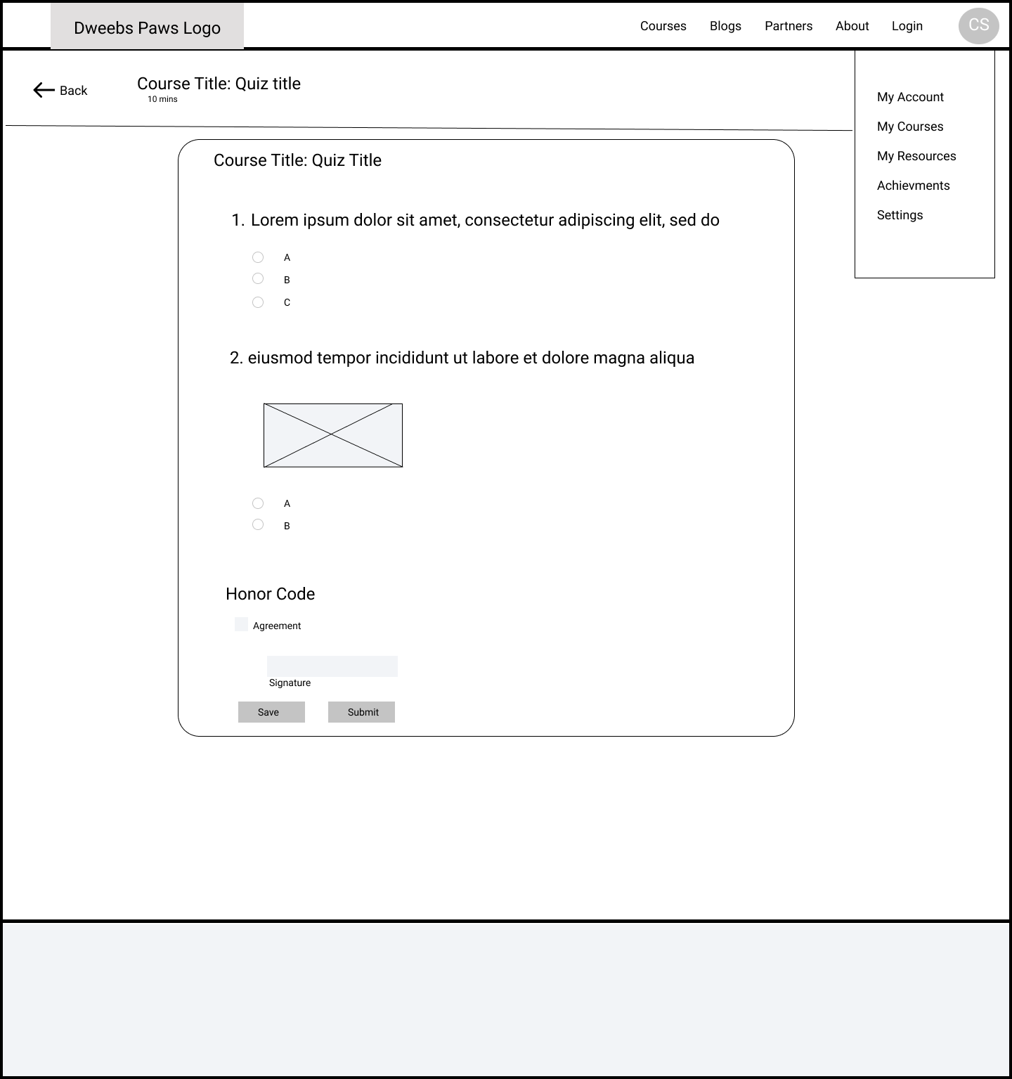
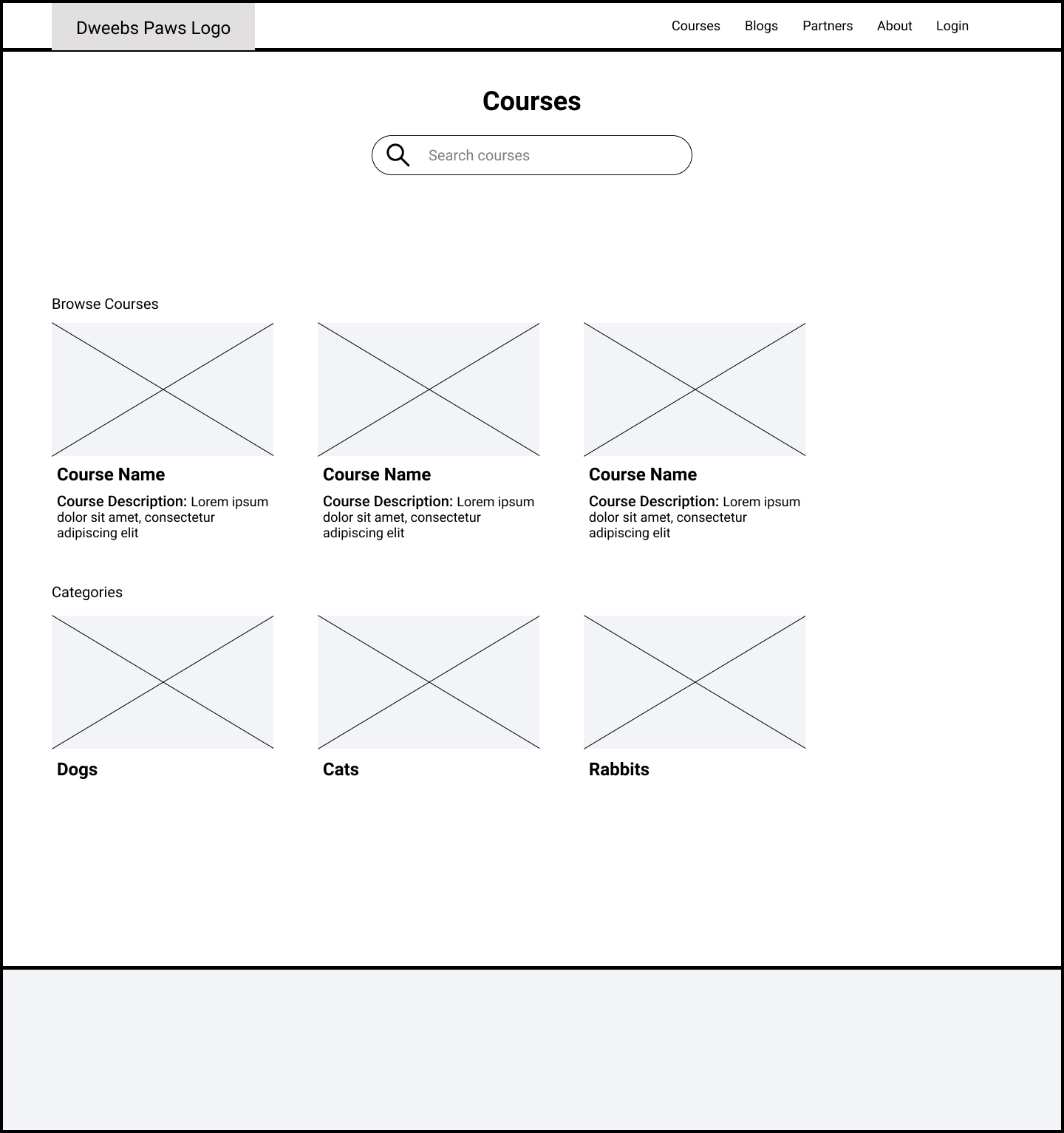
Since our team was still figuring out the process of remote ideation we decided the quickest way to ideate was through black-and-white wireframing.
Mid-fidelity Wireframe
Since our team was still figuring out the process of remote ideation we decided the quickest way to ideate was through black-and-white wireframing.
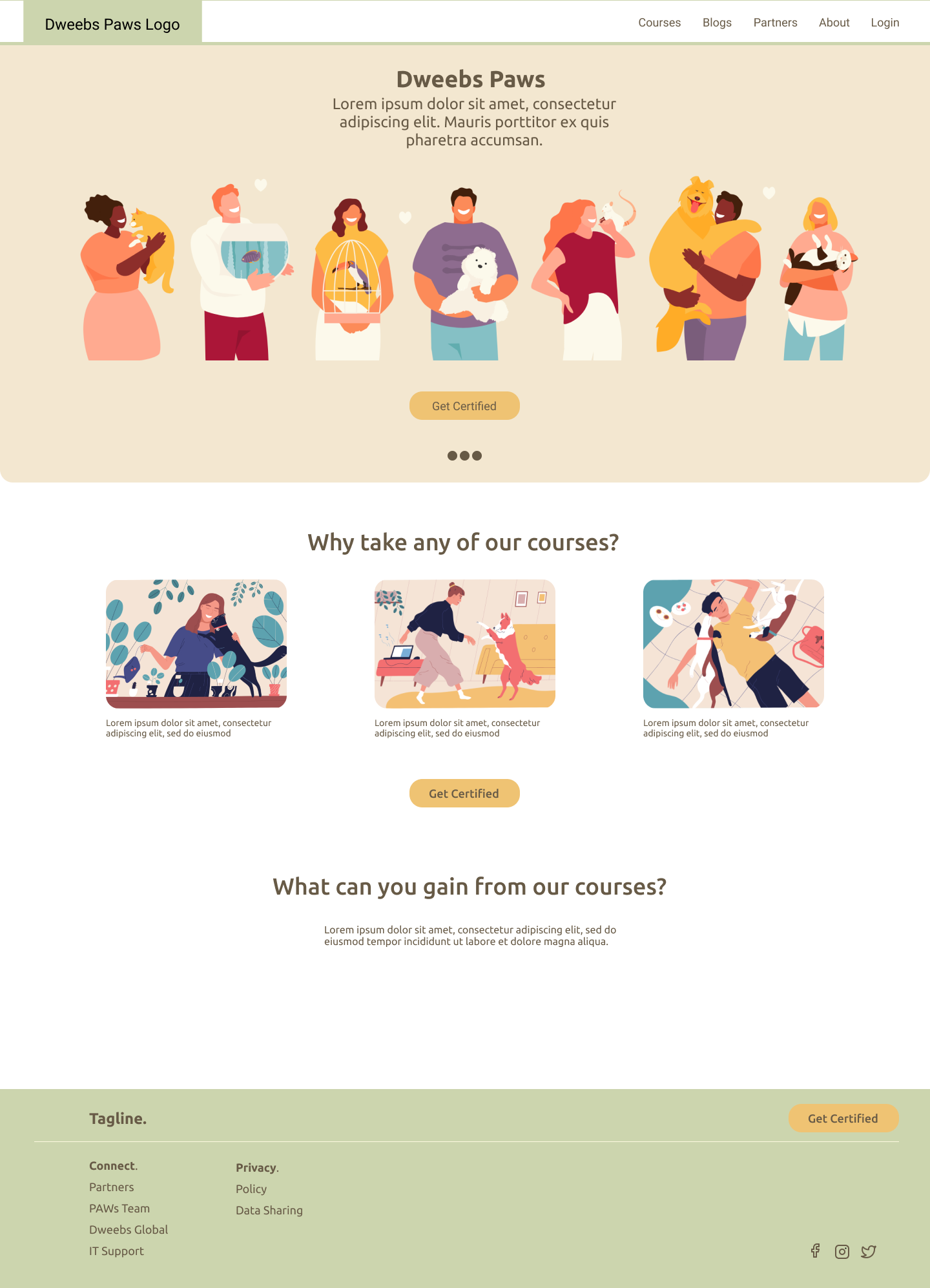
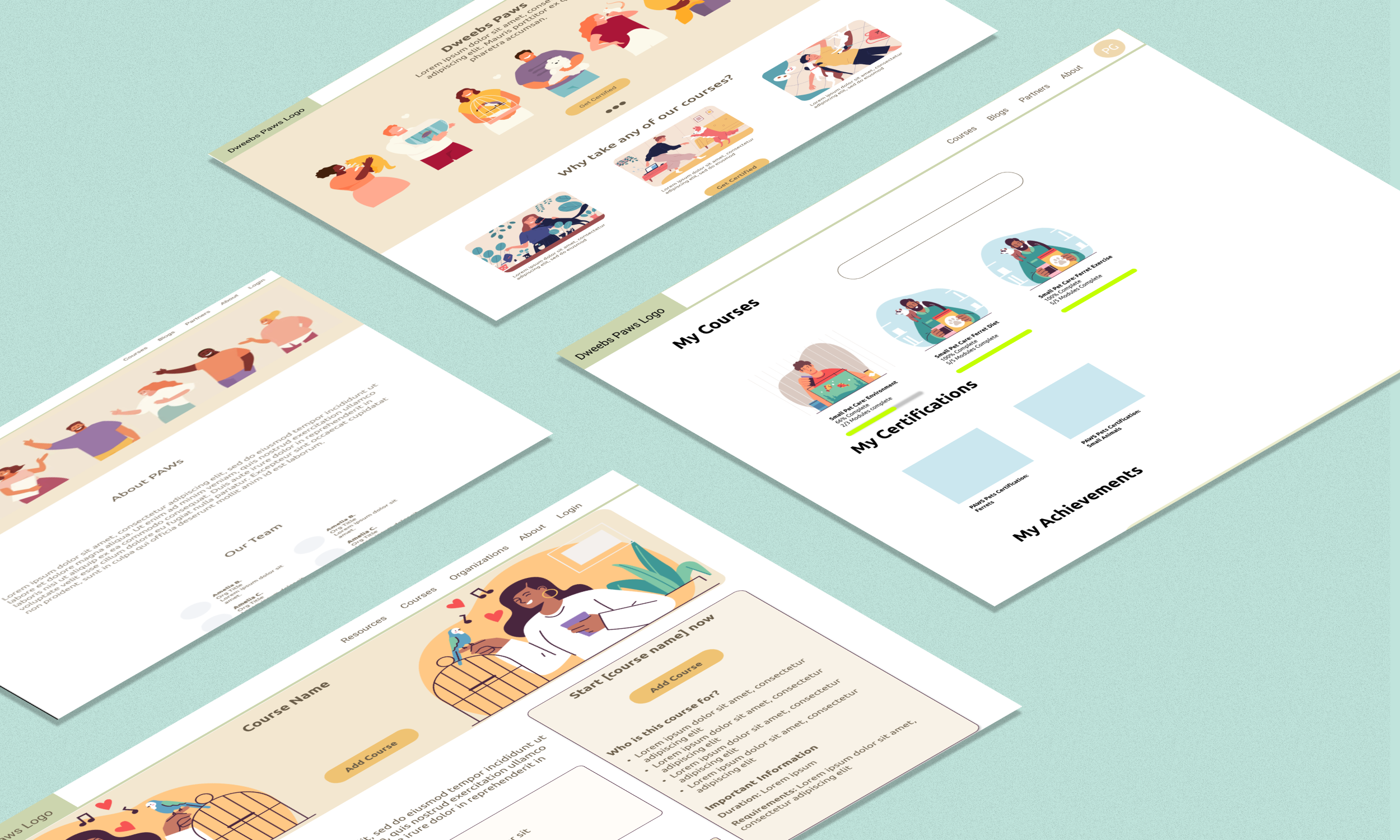
PAWS Landing Page
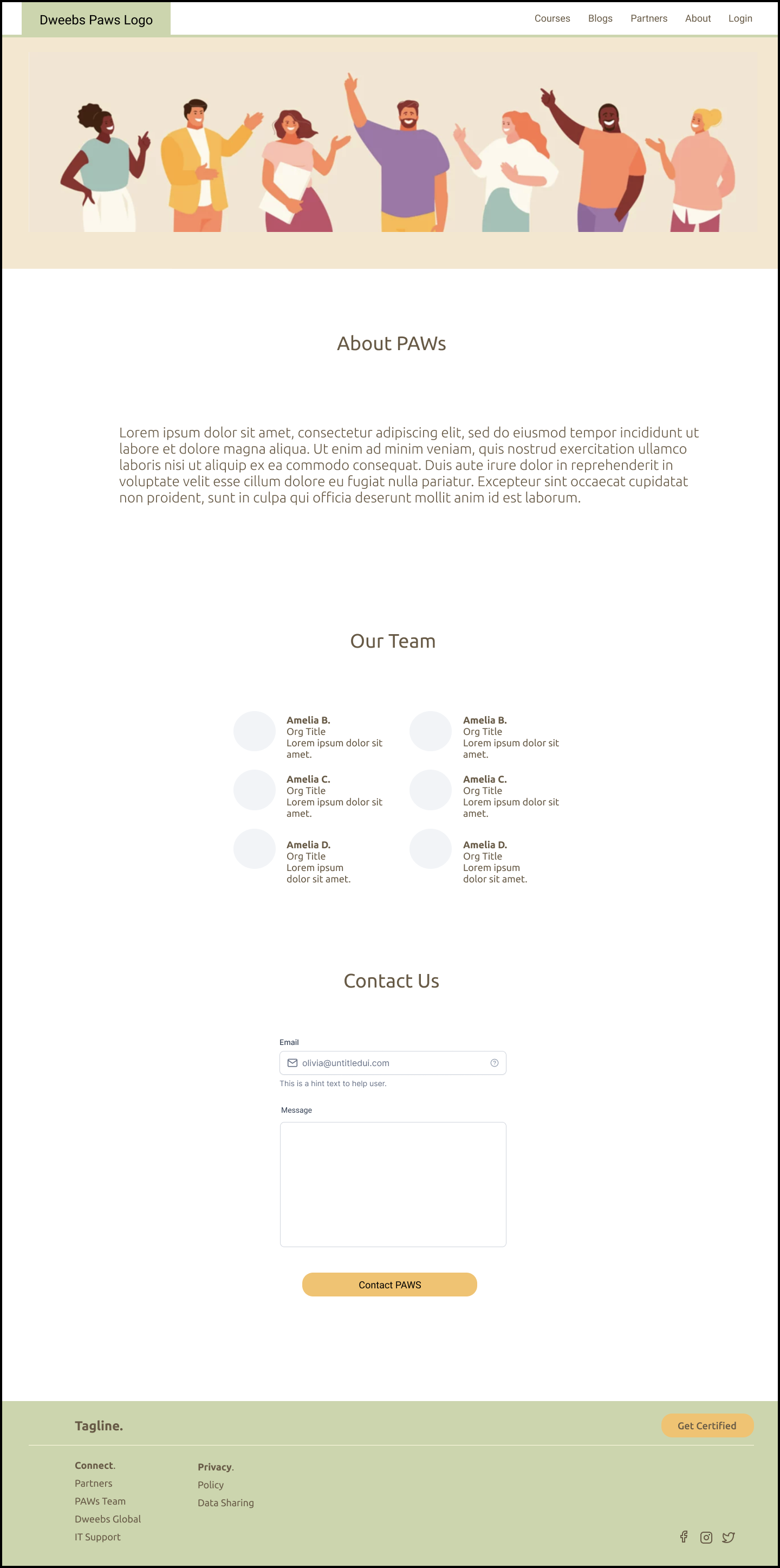
PAWS About Page
PAWs Partners Page
PAWS Registration
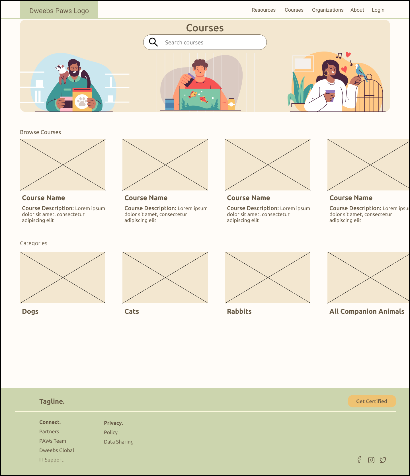
PAWS Course Search
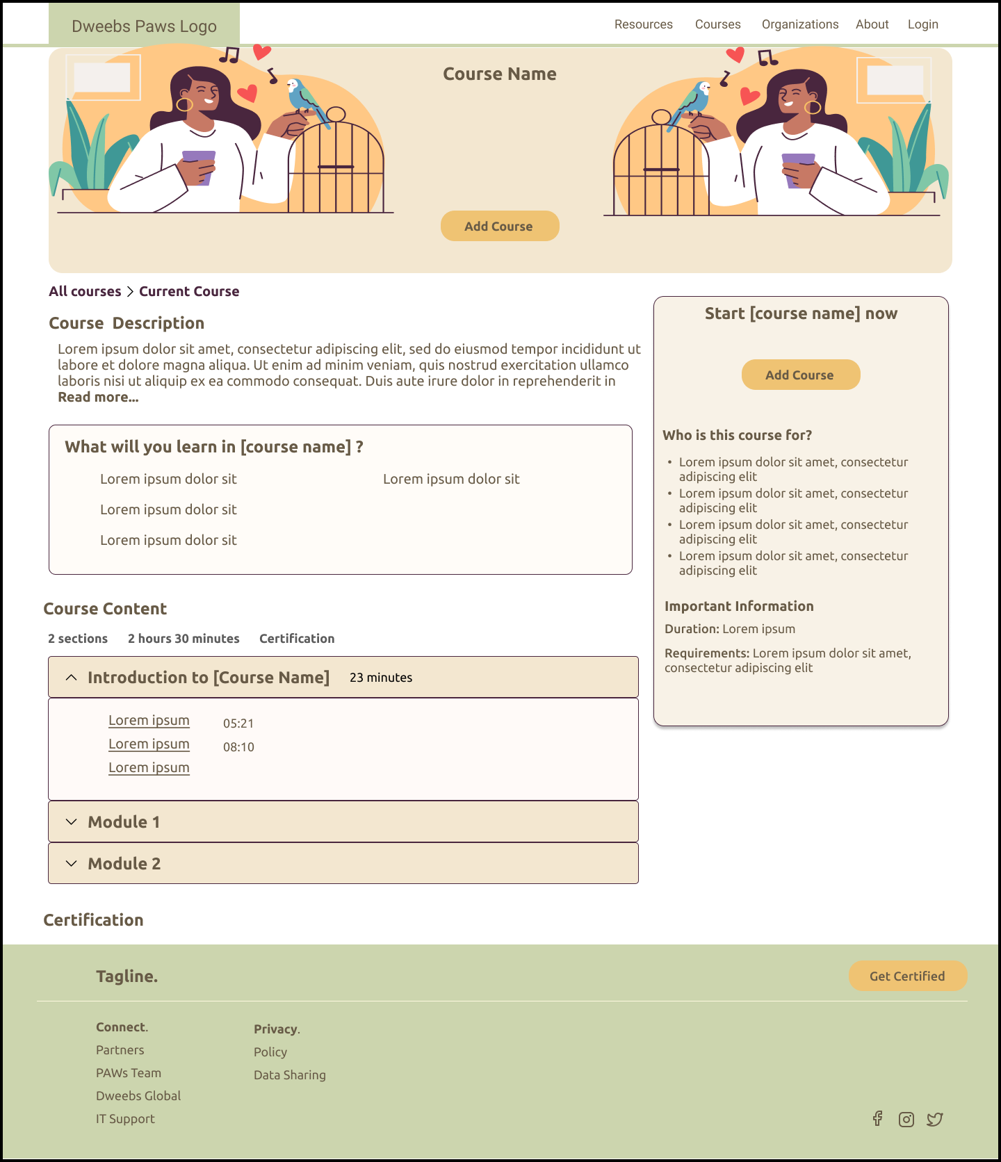
PAWS Course Description Page
PAWS Login
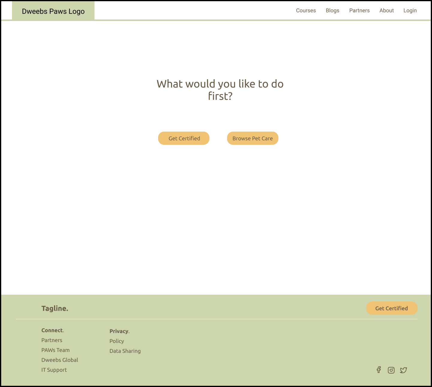
PAWS Onboarding
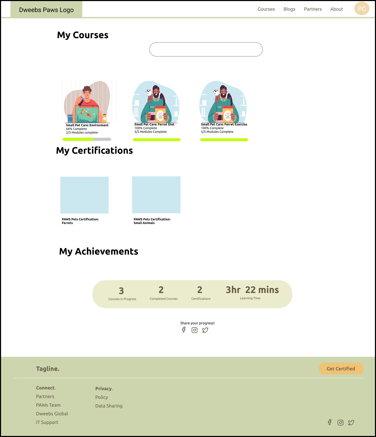
PAWS My Course
What’s Next?
Timeline: 4 weeks
We would include more course content and copywriting. We worked on an outline of the course module and wireframes for different course formats, but we want to include quizzes, video content, and infographics.
We would create a user testing plan to test the non-course navigation and then the course navigation, once we have more context for content
Opportunities and areas of improvement.
Connection Portal with Vets and Rescues
General Application Platform
Community Forum
Buy-in from leadership about why the research is needed prior to testing and designing.


